A Vancouver farmhouse by Sophie Burke Design
Natural materials and an organic palette – balancing both a traditional and modern aesthetic
Understated, elegant and timeless: These are just a few words that come to mind when we think of Sophie Burke Design. Recently, we caught up with Sophie Burke, Principal and owner of her eponymous design firm, to discuss what shapes her approach to creating beautiful spaces for the people who live in them. Skillful in the delicate balance of implementing contrasts within her designs and instilling a signature Pacific Northwest aesthetic, Sophie takes us through the journey of how one Modern Farmhouse came to life.
First, tell us about your start in the design business and what moved you to launch your own practice. Any big surprises along the way?
I had studied design in London and then worked at Conran & Partners for three years. When I moved back home to Vancouver I founded my firm Sophie Burke Design. There were lots of surprises along the way… learning how to run your own business is a steep learning curve! One of the nicest surprises has been how close you become with your clients over the process of designing their homes. I have really enjoyed that aspect of the business.
I’ve heard you mention a certain Pacific Northwest aesthetic. As a designer based in Vancouver, how are your projects influenced by your surroundings and the rich culture of your city?
I think we are very influenced by the muted tones and rugged, natural elements of the Pacific Northwest. The colours around us are often subdued and in the cool tones – bluish gray skies, ocean and mountain, and stone. From our office window we look out across the blue ocean to the North Shore mountains with the clouds constantly moving across them. I do think that place influences palette and as a result I am drawn to a very natural, organic palette that tends towards the cool tones – blues, greys, navy. We use a lot of natural materials wherever possible, like basalt, marble, soapstone, burnished metals, linen, wool, lighter woods, and many of them local – pale whitewashed Douglas fir, cedar and hemlock.
You’re drawn to the tension between contrasts: Old and new, high and low, modern and classic. How did these polarizing elements play into the design process for the Modern Farmhouse project?
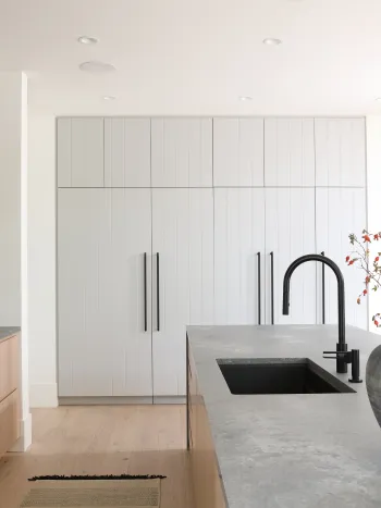
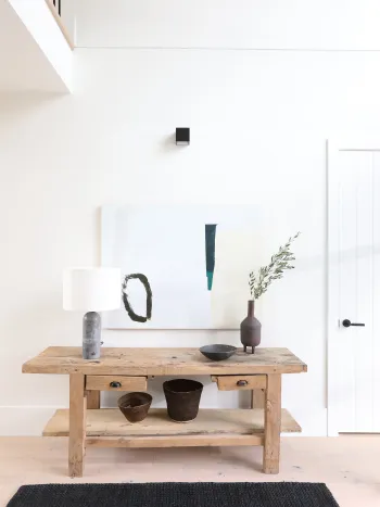
We designed the home to exude a sense of timelessness. We used mixed materiality with a slightly lived in feel: wide plank white oak paneling, reclaimed wood beams, rustic grade flooring, large expanses of soaptone and blackened metal. We contrasted these with clean design details such as trimless windows, crisply detailed millwork, and contemporary lighting in order to find a balance between new and old, modern and classic.
Speaking of modern and classic, the kitchen is an absolute showstopper and we love how you specified the TARA ULTRA Pull-down in matte black which really stands out. Tell us about your overall vision for this space.
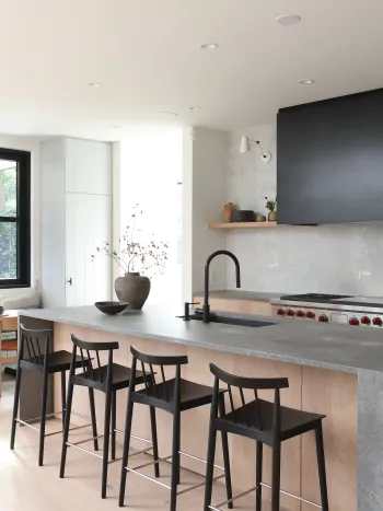
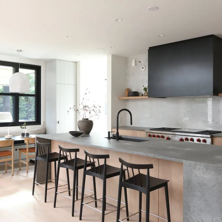
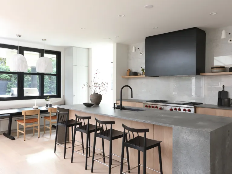
The kitchen was conceived as a working, farmhouse kitchen but minimalized by using large expanses of materials, massing, and simplified gestures. The large range with the blackened metal hood fan makes a very strong statement on the back wall. The island feels incredibly weighty with its rugged stone counter. The kitchen is connected to the double height living room opposite, and we knew it would be important for it to stand its ground and feel balanced against the large adjacent space. We opted to forgo traditional upper cabinets and instead to have open shelves which could hold an eclectic grouping of objects that draw the eye in. The sink is on the island, facing into the nook and living room. The black TARA ULTRA faucet with its beautiful clean lines contrasts really well against the more rugged stone finish.
How did you settle on the combination of various surfaces, materials and finishes? From the warm cabinetry to the industrial-feel counters, the full-wall backsplash, etc.?
We chose to use white oak on the island and back wall of the kitchen for its warmth and to balance out the cooler colour of the stone counters. The planked wood on the back of the island is a theme that is carried throughout many of the spaces, and adds to the Farmhouse look. The marble backsplash is clean and elegant, adding interest to the back wall; the simple bold application of a single finish keeps things from looking fussy and overly wrought. The millwork on the outer walls of the kitchen has a saw–‐cut detail which again adds to the Farmhouse feel and is a detail that is used in other millwork throughout the house. Black elements are woven in with cabinet hardware, plumbing and accessories, all serving to ground the space.
Are you seeing any particular design requests trending among your clients?
I think in general we are seeing requests for more natural, organic elements woven into the design. We see it with furniture, pieces that have curvy, organic shapes or natural materials such as cane or rattan, architectural details with rounder, softer elements coming into play, and even in the materials themselves: clay based tiles with natural glazes; metals with softer more aged, burnished finishes.
Featured in this high-end-project: Luxury kitchen faucet TARA ULTRA
For fun: If you could live in one historical figure’s house, who would it be and why?
I would love to live in London in the 19th century to experience the city as it was then. I could see living in Virgina Woolf’s home in Bloomsbury, getting a glimpse of the life of a writer and her artistic friends.
What’s been your career highlight to date, and what do you still hope to achieve?
We were featured in the Globe and Mail, one of our national newspapers, as part of their ‘Designing Canada 2020’ article, which was really a highlight. Our Mountain Retreat 1 project was chosen as a Reader’s Choice Home of the Year which we felt very honoured by. It was also featured in Elle Décor – it has always been a dream of mine to be featured in one of the Elle design magazines so it was really exciting when that article came out.
What’s next for you? Anything we should be on the lookout for?
We would love to develop a line of custom furniture in partnership with a local furniture designer. Stay tuned.
